Counterpart Insurance — Branding Concept
- Nick Arutyunov
- Jun 3
- 1 min read
Updated: Jun 4

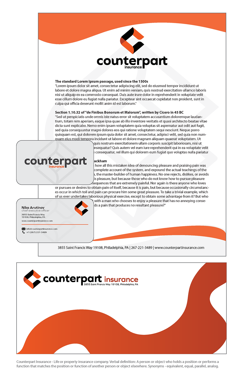
This logo was created as part of a college project by Nick Arutyunov, exploring visual identity design for a fictional insurance company.
The concept focuses on trust, clarity, and modern professionalism - essential qualities in the insurance industry. The abstract “C” mark, combined with clean typography and a bold black-orange palette, conveys strength and reliability while staying visually distinctive across various formats.
This project allowed me to experiment with corporate branding systems and demonstrate how a simple logo can be expanded into a full visual identity.
As part of the Counterpart Insurance branding project, I reimagined the typeface to reflect the core idea of “equivalence” and “balance.”
Using the Graphie typeface as a base, I made subtle adjustments to letters like UN, T, and RT, so they "counterpart" one another - visually echoing the brand's core message of symmetry, reliability, and parallel relationships.
This linguistic and visual connection is reinforced with a minimalist grid and modern geometric construction. The name Counterpart isn't just a label - it's a concept embedded in every design decision, from layout to form.


Comments